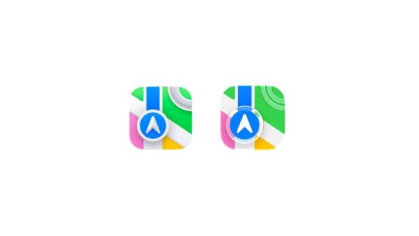
Apple has announced that app icons will receive a Liquid Glass update in iOS 27, extending the translucent, refractive design language that debuted with iOS 26 to the home screen in what represents the most sweeping visual change to the iPhone’s core interface since the flat design overhaul of iOS 7 in 2013.
Liquid Glass, Apple’s signature aesthetic that uses a translucent material resembling frosted or tinted glass with dynamic light refraction, had previously been applied to system UI elements including the Dynamic Island, control panels, notification surfaces, and app interfaces. Bringing it to app icons themselves completes the visual unification of the entire iOS surface, from the home screen through every layer of the operating system.
What it means for the home screen
The Liquid Glass treatment on app icons introduces a level of dynamism to the home screen that static icons have never had. Depending on the wallpaper behind them, icons will refract and reflect light differently, creating a home screen that responds visually to the content beneath it rather than sitting as a static layer on top. The effect is intended to make the phone feel more alive and visually coherent, with the interface and wallpaper feeling like a unified surface rather than separate layers.
Apple demoed the ability to adjust the transparency of Liquid Glass elements in iOS 27, addressing one of the most common criticisms of the design language when it debuted, that the translucent surfaces could make text and interface elements harder to read. The customisation option gives users control over how aggressively the glass effect is applied, softening the accessibility concerns that accompanied its initial rollout.
The design debate continues
Liquid Glass has been one of the most polarising design decisions Apple has made in years. Fans of the aesthetic argue it gives Apple devices a distinctive visual identity that no other platform replicates, and that it leverages the display and GPU capabilities of modern iPhones in ways that flat design cannot. Critics counter that translucency reduces readability and that the effect can feel more like a visual gimmick than a functional improvement.
Extending it to app icons, the most used and most seen element of the iPhone experience, will intensify that debate considerably. Every third-party app icon will now need to work within the Liquid Glass framework, raising questions about how developer-designed icons will interact with the treatment and whether Apple will provide tools or guidelines for icons that were not designed with translucency in mind.
The full impact of the change will become clearer when iOS 27 developer betas drop and the design community gets its hands on the actual implementation.
-
Uttarakhand Chief Minister Honors Basketball Pioneer Ulhas KS

-
Concerns Rise Over Treatment of Teams at FIFA World Cup 2026

-
India Gears Up for Asian Games 2026 with Esports Team Announcement

-
'Not a sackable offence': Atherton and Hussain back Ben Stokes

-
Manchester City make £106m verbal offer for Nottingham Forest's Anderson