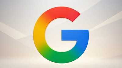
Google redesigns app icons across its product ecosystem
27 Apr 2026
Google is expanding the rollout of its new gradient icon design across more apps.
The updated look ditches the uniform circle design that packed every color of the Google logo.
Instead, it features softer aesthetics with rounder corners and gradients that smoothly transition from pastel to more saturated primary colors.
AI integration and new look
Design evolution
The new design language has already been seen in updated versions of the Google G logo, as well as Gemini, Photos, and Maps.
9to5Google reports that this change signifies the integration of AI-powered features into these apps.
The fresh icons are more playful, vibrant, and diverse than their predecessors. They also ditch the flat designs popular in the late 2010s and early 2020s for a more modern look.
Workspace apps also get a makeover
Fact
Google Sheets, Slides, Forms, Sites, and Keep have all adopted the new design trend. Most of the icons are more visually distinct and often use a single color. For instance, Chat has replaced four-color speech bubble outline with green blob featuring a smiley inside it..
-
ABP Live Pet First: 8 Essential Tips To Prevent Heatstroke And Keep Your Furry Friend Safe
-
'No One Is Speaking': Axis My India Holds Back Bengal Exit Poll Data, May Skip Forecast

-
KDMC Supports 999 Specially-Abled Students Under Inclusive Education Drive, Distributes Free Assistive Devices To 81 In Kalyan
-
Mumbai University Revises M.Com Semester 1 Results After Student Protest Over Alleged Discrepancies

-
'I Don't Want To Get Dragged...': Baseer Ali Finally Reacts To Unfollowing Mridul Meena Amid Parth Samthaan Row