Apple’s Liquid Glass redesign was supposed to make macOS feel modern again. Instead, for many users, it made the operating system feel unfinished.
Now, according to Bloomberg’s Mark Gurman, Apple is preparing interface refinements for macOS 27 to address complaints around readability, transparency, and visual consistency introduced with macOS Tahoe.
That is unusually fast by Apple standards. And it quietly suggests the company knows Tahoe’s redesign did not land quite the way it expected.
Liquid Glass Looked Better in Concept Than Reality
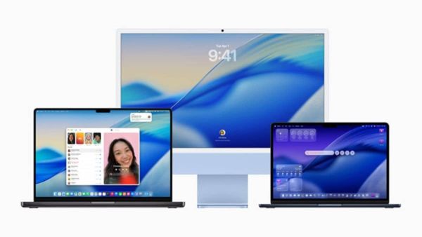
When Apple introduced the Liquid Glass design language across iOS, iPadOS, and macOS, the idea was clear. More depth. More translucency. More visual layering. A cleaner, softer interface that blurred the line between hardware and software.
In practice, macOS Tahoe often looked as if someone had accidentally lowered the contrast settings across the system.
Sidebar transparency created readability problems. Shadows behaved inconsistently. Certain UI elements looked elegant in Apple’s demos and strangely washed out in actual daily usage.
The issue was not the broader aesthetic direction itself. It was execution.
Apple Rarely Admits Design Missteps This Quickly
What makes this report interesting is the timing. Apple usually commits hard to design overhauls, even when users initially dislike them. The company tends to refine interfaces gradually over several years rather than responding immediately to criticism.
But Gurman’s report suggests macOS 27 will specifically refine transparency, shadows, and visual hierarchy to make Liquid Glass behave more like Apple’s design team originally intended.
That wording matters because it implies Tahoe may have shipped before the implementation was fully polished. Which aligns with how the operating system often feels right now. Visually ambitious, but occasionally inconsistent in ways older macOS releases rarely were.
Apple Is Prioritising Stability Again
The report also says Apple is focusing heavily on software reliability, efficiency, and performance improvements across macOS 27 and iOS 27.
That sounds suspiciously similar to what Apple did with iOS 12 back in 2018, when the company temporarily shifted focus away from flashy features toward fixing performance issues and improving stability after criticism surrounding iOS 11.
That comparison feels increasingly relevant. Because the last few years of Apple software have often felt more ambitious than refined. AI features launched partially complete. Siri upgrades delayed repeatedly. Visual redesigns arriving before optimisation fully catches up.
Tahoe may have become the clearest example of that imbalance.
This Is Bigger Than Just UI Tweaks
The interesting part is not simply that Apple is adjusting transparency effects.
It is that the company appears to be rebalancing priorities after spending the past two years aggressively chasing AI and cross-platform visual redesigns simultaneously.
Apple’s historical strength was polish. The company rarely shipped software that felt conceptually unfinished. Recently, though, that reputation has weakened.
macOS Tahoe became a symbol of that shift:
- ambitious redesign
- inconsistent implementation
- mixed user reception
- performance complaints
- visual readability issues
macOS 27 now sounds less like another major redesign and more like a corrective release. And honestly, Apple probably needs one.
The Bigger Risk for Apple
The danger for Apple is not that people dislike Liquid Glass specifically. It is that Apple software has started feeling less invisible.
The best Apple interfaces historically disappeared into the experience. Users focused on the task itself, not the interface mechanics underneath.
When users begin actively noticing transparency layers, inconsistent contrast, or UI readability problems, something has already gone wrong.
Good interface design rarely draws attention to itself.
macOS 27 May Be Apple’s ‘Cleanup’ Release
If these reports are accurate, macOS 27 could become less about introducing radical new visual ideas and more about making Apple’s existing vision actually feel complete.
That is probably the correct move. Because right now, Tahoe often feels like the first draft of a very good redesign rather than the finished version Apple normally ships.
And for a company that built its reputation on polish, that distinction matters more than Apple would probably like to admit.
-
Great taste with chapati or bread! Make a spicy spread from sweet and sour curry, note down the recipe

-
Ayurvedic: By eating this fruit even old people get the strength of young people! Know about this fruit full of medicinal properties

-
How to make DIY hair conditioner for summer hair

-
The one surprising rule divorce attorneys swear by on 3rd date

-
Va-va vintage: London Jewelers searches the globe for heritage treasures