
Planet Football
·4 June 2026
We’ve finally reached the end of our exploration through the 48 home kits that will be on display at this summer’s World Cup.
We’ve seen the bad, the decent, and the outstanding — now we arrive at the very best of the bunch.
To our surprise, several adidas designs have made it to the top despite their much-criticised stripe issue. Yet, it’s a Nike kit that claims the number one spot, with a superb Puma creation taking second place. The three big brands have all delivered strong designs, though some smaller labels have also made a serious impression.
There’s a touch of the Macron-made Crystal Palace shirts from the 2022/23 and 2024/25 seasons here, with a free-flowing striped design that refuses to stay within the lines. It brings back memories of early school days and the dreaded Mrs Palmer shouting, “NO SCRIBBLING!” whenever our colouring went astray.
Macron were onto something with those Palace kits, and now Puma seem to have struck gold with Paraguay’s version. We may change our minds later, but for now, the South Americans have won us over.
Tomorrow, perhaps, we’ll be shouting “NO SCRIBBLING!” again.
Capelli have produced something magnificent here. Imagine a navy reinterpretation of Arsenal’s iconic bruised banana shirt, but with a twist — the triangular design represents the flight routes connecting Cape Verde’s islands. The smaller nations and their kit partners are making a huge impression this World Cup, and it’s wonderful to see.
We’re still debating which adidas kits frustrate us more — the ones that aren’t great to begin with, or the brilliant ones ruined by the new stripe layout. This particular design would be near-perfect if it just had the classic adidas stripes.
The central placement of the crest is superb, with the shirt’s curved graphics drawing the eye toward the JFA badge, giving it visual dominance over the adidas Equipment logo. It solves one of the main problems of centred crests beautifully. The collar is elegant too — an excellent kit overall, aside from the recurring stripe fiasco that has plagued all adidas home designs at this tournament.
Yes, the thick adidas stripes are here again, and the long-sleeved version remains a disaster. Still, this is one of the less offensive adidas home kits on show. We’re usually cautious when global brands incorporate local motifs into national kits, but the circular Aztec-inspired pattern here works brilliantly and distracts from the stripes. The ‘SOMOS MEXICO’ (WE ARE MEXICO) on the back ties it perfectly to the host nation. A very respectable design.
Now this is how you divert attention from those dreadful stripes. The pattern might remind you of old-school arcade games like Space Invaders — and we love it that way. More football kits that evoke retro games, please. Newcastle fans, however, might feel a sting seeing Saudi Arabia pull off such a gem after years of questionable green kits.
England’s kit is not flashy or revolutionary — it’s just really, really good. It strikes the perfect balance of navy and red, hitting the sweet spot between looking too much like Tottenham or Bolton. The collar and cuffs subtly nod to the flag without being over-the-top.
Interestingly, this is the only kit we’ve slightly marked down because of the shorts — they’re white, and they shouldn’t be. England’s shorts should always be navy, or occasionally light blue for retro flair, but never white. When the shirt already has the ideal amount of navy, white shorts simply throw off the balance.
It’s still hard to accept that this will be Germany’s final World Cup kit made by adidas. The partnership feels timeless, and imagining another brand stepping in seems wrong. Sadly, their farewell kit suffers from the same thick-stripe problem, but the design itself is outstanding. The fusion of the 1990 and 2014 World Cup-winning looks is genius. If only it had proper stripes, it might have topped our list.
Big prints are trending this year, and both secondary hosts have embraced the look. Canada’s two-tone red maple-leaf kit is one of Nike’s most elegant and cohesive designs. The geometric collar template works perfectly here, kept simple and bold in red. The away version, in silvery-white, is equally impressive — a testament to strong repetition done right. It’s a masterclass in national symbolism done tastefully, something the USA could learn from.
France’s kit also stands out — incorporating a large blue cross with a subtle internal graphic. It should feel overdone, yet it works beautifully. The inspiration stems from the 1997 Umbro shirt that featured an offset cross, though this time the execution is flawless. What was once a mess has become a masterpiece.
South Korea’s kit is another triumph. We could spend hours admiring Son Heung-min showcasing it with a smile. The all-over pattern is bold but balanced by minimalist details — red throughout with subtle black and white trimming. Paired with their stunning away kit, South Korea might be the best-dressed team this year.
Every World Cup has that one kit that captures everyone’s attention — this year, Curacao’s away strip is making waves. Unfortunately, unless they progress beyond the group stage, we may not get to see it in full action. That’s where Ghana steps in: their home kit, with a wild pattern radiating from the black star, is inspired by traditional Ghanaian fabric. It also happens to resemble a psychedelic spider web — and we love it.
We usually dislike buttons on football shirts, but the top-ranked home kit of this World Cup is so good it makes us forget that rule. It’s simply gorgeous — and the team wearing it might just lift the trophy too.
-
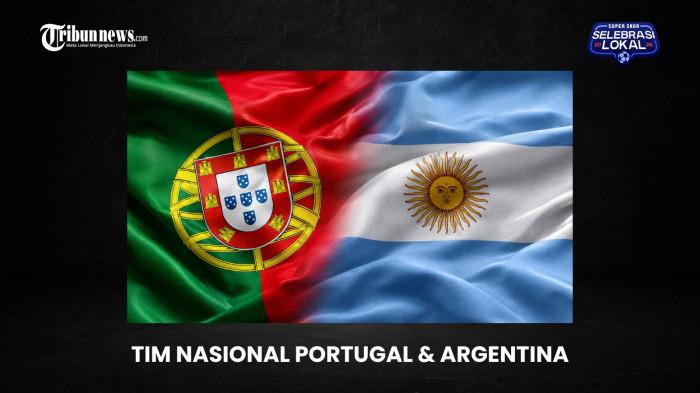
Cristiano Ronaldo’s Final Dance at the 2026 World Cup: The Last Chapter in His GOAT Rivalry with Lionel Messi
-
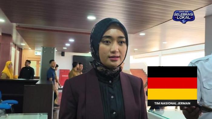
Germany’s Bold Coaching Decision for the 2026 World Cup Backed by Deputy Governor Jihan
-
22 Players at the 2026 World Cup Who Have Already Lifted the Trophy
-
2026 World Cup: Puteri Indonesia Riau Prima Yohana Backs France and Brazil

-
Fiction: Ashwini's mind spirals as denial and loneliness take over when she's diagnosed with cancer