One of the first things a new driver has to learn is the meaning of signs. Some traffic signs can be very confusing, but there’s little room for interpretation with others. The stop sign, for instance, requires drivers to stop completely before proceeding when it’s safe, and is often stationed at intersections. Veteran drivers will know this, of course, but there’s one thing about this familiar sign you might not be aware of: Why it’s such an unusual shape.
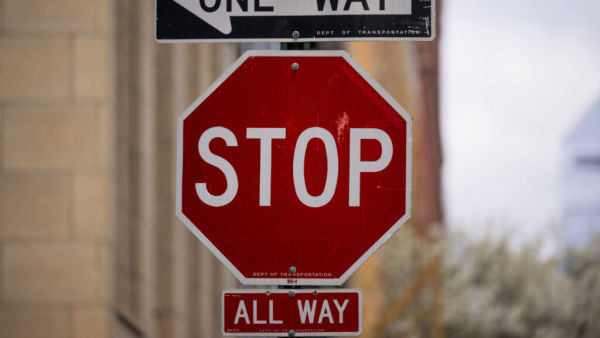
The octagonal shape is exclusive to stop signs. Couple this with the size of the text bearing the legend “STOP,” and the intent is clear: Stop signs are designed to be immediately recognizable, regardless of weather conditions or anything else that might make the letters illegible. From the unmistakable shape alone, you know exactly what it says and what to do. This is important because the sign has a critical safety function.
With their visibility being paramount, some authorities have introduced other measures to help ensure that drivers can’t miss stop signs. In February 2014, the Minnesota Department of Transportation issued a report detailing the effects of stop signs fitted with LED lighting, which had been fitted around the state. The report concluded that right-angle crashes were cut by about 42% in the areas where the signs had lights installed. Though the University of Minnesota’s Gary Davis conceded that “it’s difficult to say the precise magnitude [of crash reduction overall caused by the lights] due to the limited amount of data available,” this measure helps highlight the importance of recognizing stop signs.
The birth of familiar road signs as we know them
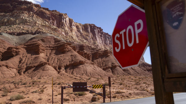
The vast majority of stop signs today, of course, are red. It’s a color that both demands attention and conveys a warning, but it’s not quite universal: Some unusual stop signs are blue instead. Though its coloring has changed over the years, it seems the stop sign has essentially always been an octagon.
The Mississippi Valley Association of State Highway Departments began setting standards for the shapes of signs in 1922. According to a report from Ohio Department of Highways Chief Engineer Harry E. Neal, “Distinctive shapes were prescribed for the several classes of signs […] a circular railroad crossing sign, an octagonal stop sign, a diamond-shaped warning sign, a square caution sign,
rectangular information signs, and a characteristic route marker to be designed by each state.”
Conventions would be amended and regulations adopted across the country as time went on. Types of signs would also settle into a general color-coding scheme, with warning signs widely being yellow, construction-denoting signs being orange, and those for recreation being brown. Further additions like a retroreflective quality use passing headlights to reflect light back at vehicles as they approach, helping again to ensure that signs aren’t missed as drivers pass by them.