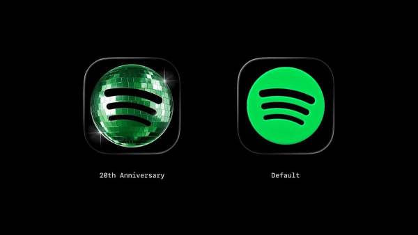
Spotify has restored its original 2D iPhone app icon after widespread criticism of its temporary disco-ball-themed redesign. Introduced in May to celebrate the platform's 20th anniversary, the festive icon received mixed reactions, with many users calling it unattractive and pixelated. Following user feedback, Spotify has now reverted to its classic logo on iOS.
Los Angeles: After backlash, Spotify has reverted to its original 2D iPhone app icon. The company's disco-ball-themed logo makeover proved unpopular with many users, who criticised the redesign and called for a return to the familiar classic icon.
Temporary anniversary redesign
The disco-ball-inspired Spotify iOS icon was introduced as a temporary tribute to the platform's 20th anniversary in May. The makeover coincided with "Spotify 20: Your Party of the Year(s)," a mobile-exclusive in-app experience that lets users revisit their listening history and relive their musical journey over the years. While the celebratory redesign drew plenty of attention, it was always intended to be a short-term change.
Mixed user reactions
Some people had defended Spotify's disco-ball as a festive and fun -- and an example of a big company taking a creative risk with its well-known logo. But many Spotify users voiced displeasure at the change-up, with some complaining that the disco ball looked pixelated on a small phone screen and, generally, was visually displeasing, as per Variety.
Original icon returns
After promising on May 17 that the original icon would return "in a few weeks," Spotify has finally brought back the familiar logo on iOS.
-
Moong Bhaji: Perfect Evening Snacks! Make Moong Dal Crispy Bhaji; Read the simple recipe

-
Facebook And Instagram Down In India?
-
Problem in Facebook and Instagram globally, users worried

-
iPhone 18 Pro Max leak shows Dark Cherry, Blue and Black variants
-
Instagram and Facebook suddenly down; Blockage of millions of users around the world, direct ‘error messages’ start appearing!