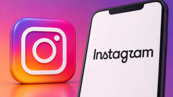
New Delhi: Instagram has made a small but significant change in its brand identity after almost a decade. The company has given a new design to the wordmark of the name 'Instagram'. However, the app's familiar colorful camera icon has remained the same for now.
What changed in Instagram's handwriting?
Instagram head Adam Mosseri shared details about the new wordmark on Instagram and Threads. According to him, the new design is more modern and sharp than before, but the glimpse of the old design has also been retained in it.
The shape and curve of some letters have been changed in the new typography. In particular, the 's', 'r' and 'g' have been made more curved, giving the wordmark a slightly cursive look.
However, users' opinion regarding the new design is not the same. Some people have liked the new font, while some users have also given funny reactions regarding the design of the letters.
Instagram logo hasn't changed yet
The new wordmark does not mean that Instagram has also changed its app logo. The company is still using the pink and purple gradient camera icon.
The icon was introduced in 2016, when the company ditched its old gray camera design for a more modern and colorful identity. This icon has been the identity of Instagram for the last 10 years.
What is the difference between wordmark and logo?
Wordmark is a way of showing the name of a brand in a special font or design. In the case of Instagram, the word 'Instagram' is its wordmark. Whereas a logo can be a symbol or graphic that identifies a brand. Instagram's colorful camera icon is its primary brand icon. Therefore the current change is only to the handwriting of the name.
Will Instagram's app icon change?
At present, Instagram has not made any official announcement about changing the app icon. Meta has also not given any clear information regarding other visual changes. This means that for now, users will see the same familiar camera icon in the app, while a new wordmark will appear in the branding text.
-
Arsenal open to selling Myles Lewis-Skelly at the right price amid growing Manchester United links

-
Man Utd told Victor Osimhen is the ‘best’ answer to striker search as Patrice Evra says fans will ‘forgive’ returning academy product Marcus Rashford
-
Pooran's 58* fires MI London to seven-wicket win
-
Never saw him as Gauahar’s Husband: Kushal Tandon on Zaid Darbar
-
Independence Day 2026: 10 Tricolour Outfit And Makeup Ideas For Office, College And Parties