Here’s a puzzle that trips up a lot of AI image users: you write the same prompt, get wildly different outputs depending on which style setting you choose, and suddenly you’re not sure which one is actually right for your project.
Style selection is one of the most important — and most overlooked — decisions in AI image generation. It’s not just about what looks cool. It’s about what works for your specific audience, output format, and goal.
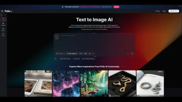
The Pollo AI image generator supports a wide range of styles in one place, which makes it a useful sandbox for experimenting across different aesthetic directions before you commit.
Here’s a practical guide to matching style to purpose.
When Photorealistic Works Best
Photorealistic AI images are designed to look like they could have been captured by a camera. They work best when you need:
- Product concepts: A lifestyle shot of a product before a physical version exists, or a mockup for an investor deck.
- Ad creatives: Paid social ads and display banners tend to perform better with photorealistic imagery because they feel more credible and trust-building.
- Editorial visuals: Thought leadership articles, blog headers, and news-style content benefit from a photographic look.
- Mockups: Visualizing how packaging, signage, or physical products might look in a real environment.
The risk with photorealistic style: it can feel generic if the prompt is too broad. Specific lighting, setting, and composition cues make photorealistic outputs feel intentional rather than stock-ish.
When Anime and Illustration Styles Are Better
Illustrated and anime-style outputs trade realism for character, energy, and expressiveness. They’re a strong choice for:
- Character concepts: Whether you’re designing an avatar, game character, or brand mascot, illustration styles give you more creative flexibility.
- Social content: Illustrated visuals stand out in feeds because they look different from the sea of photographic content.
- Posters and cover art: Bold illustration styles work well at large format and hold up when printed or displayed at scale.
- Niche fandom audiences: Communities around anime, gaming, and fan art expect — and appreciate — illustration-native aesthetics.
The risk here: illustration styles require more specific prompting to avoid generic results. Anime style covers an enormous range from Studio Ghibli softness to sharp shōnen intensity — being specific about sub-genre cues matters.
When Line Art or Concept Art Is the Smarter Choice
Line art and concept art styles are underused, and often the smartest choice for certain workflows:
- Early ideation: A clean line-art version of a concept communicates the idea without distracting color or texture decisions.
- Storyboarding: Lightweight visual sequences benefit from the clarity of line art — it’s easy to read quickly and iterate on.
- Design communication: When presenting an early direction to a team or client, concept art-style outputs are easier to mark up, annotate, and refine collaboratively.
- Technical or instructional visuals: Sometimes a clean, simple diagram-style illustration communicates more clearly than a photorealistic or heavily stylized image.
Line art outputs are also faster to evaluate — the composition and proportion show up clearly without color or texture layering over them.
Comparing Style Breadth Across Tools
Not every AI image generator handles all three of these style categories equally. Some are built around photorealism; others are optimized for anime generation; very few handle the full range with consistent quality.
A PicLumen comparison for style variety is worth considering in this context:
PicLumen explicitly covers photorealistic, anime, line art, and concept art modes, along with enhancement tools like upscaling and background removal. That kind of style range makes tools like PicLumen AI more useful for generalist creators who work across different project types than tools locked into a single aesthetic.
When evaluating any AI image generator for style breadth, test it with a consistent prompt across all three style types — photorealistic, anime, and line art — and compare. Consistency and quality across modes tells you a lot more than any individual demo image.
A Simple Decision Framework
If you’re not sure which style to use, answer these four questions:
1. What’s the goal? Is it to inform, to sell, to entertain, or to communicate an early-stage idea? Each goal pushes toward a different aesthetic register.
2. Who’s the audience? A professional B2B decision-maker expects different visuals than a gaming community fan or a lifestyle Instagram follower.
3. What’s the output format? A print poster, a social story, and a slide deck all have different visual needs. Make sure the style you choose holds up at the format and scale you’re actually publishing to.
4. How much time do you have to iterate? Photorealistic and anime styles often require more iteration to get right. Line art and concept art tend to communicate intent clearly on an earlier pass, making them useful when you’re in a hurry.
Match Style to Outcome, Not to Trend
The best-looking style isn’t always the right one. The right one is the one that serves your audience, your format, and your goal.
If you want to experiment across all three before committing, try the Pollo AI image generator — it’s a practical way to test photorealistic, anime, and concept art directions from a single interface without switching platforms.
-
Raja Raghuvanshi REBORN? Baby Born at Exact Date & Time of His Death, Family Calls It Miracle, Named Him Raja
-
Fears popular UK fish and chip shop could close after 94 years

-
New Dating Trend Allows Partners To Cheat! More About Tolyamory & Why It Is A Red Flag

-
Martin Lewis urges shoppers to look out for this code when buying medication
-
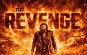
What Makes 'Dhurandhar: The Revenge' a Record-Breaking Hit? Discover the Secrets Behind Its Success!