We continue with part two of our 2026 FIFA World Cup kit rankings, moving into the section of the list where the designs start getting interesting. While we’re still in the lower half, several of these kits genuinely catch the eye — even if a few are marred by those infamous adidas stripes that continue to test our patience. Deep breaths, everyone; those stripes might just drive us to madness before the tournament ends.
If you missed the first part of our rankings, that’s where the true disasters lie. But now we’re into the mid-table kits, ones that often come close to greatness.
Take Scotland, for instance. Their latest home shirt is a beautiful deep navy, with just the right sheen for a classic football look. The subtle saltire detailing gives it a touch of national pride, while the centrally placed Scotland crest pairs neatly with an equally centred adidas Equipment logo. It’s clean, balanced, and understated — which is why the thick, uneven adidas stripes feel so out of place. In another era, this would have been close to perfect.
That’s the real tragedy here. The design itself is so competent that the flawed stripes stand out even more. Adidas’ baffling decision to alter the width of their iconic three stripes remains one of the most frustrating choices in sportswear design. The fact that this shirt was so close to being great only makes it worse. Sadly, there are more adidas home shirts ahead, and we’ll be groaning about those stripes every single time.
Ecuador’s kit, made by Marathon, sticks rigidly to tradition — yellow base, blue and red trim. The brief was simple, and they’ve delivered exactly that. Nothing wrong, but nothing exciting either. It meets expectations without exceeding them.
South Africa, meanwhile, have moved on from Le Coq Sportif to adidas, only to end up with another victim of the fat stripes. The home kit is dull, and while there’s a supposed nod to linguistic diversity in the shirt’s subtle pattern, the execution is too weak to impress. With yellow and green being tricky colours to balance, they’ve leaned too far into a Brazil-like look, especially with that round green collar. It’s inoffensive but uninspired.
By Puma’s standards, the next kit isn’t too bad. The collar looks like two different designs fighting for dominance, but the detailing gives it a certain charm. Despite our usual aversion to buttons on football shirts, the patterned fabric on the collar and sleeves is genuinely appealing. Gold accents, limited to the Puma logo, add a tasteful touch. However, balance remains an issue — if you centre one logo on the chest, you must centre both, or the design feels off. There’s hope that once names and numbers are added, the overall look might improve.
Croatia’s checkerboard is a staple of every major tournament. While this version isn’t the best, it’s far from the worst. The squares are smaller than ideal, and the central plain section, designed to accommodate the shirt number, slightly disrupts the pattern. Still, the concept remains iconic. As always, their away version mirrors the home but in two-tone blue — a sacred Croatian tradition that continues.
Qatar’s adidas kit had the potential to be striking, with the zig-zag from their national flag offering a perfect design cue. Instead, the execution is bland. The zig-zag runs down the centre, but the rest of the shirt, with its simple white round collar, feels lifeless. And yes, the oversized adidas stripes return to ruin it further. It’s hard to comprehend how this was approved — it feels like a betrayal of adidas’ proud design heritage.
Spain’s home kit almost manages to redeem the stripe issue by cleverly incorporating the national colours into them. The navy sleeves and multicoloured stripes reduce the visual damage. The pinstripe detailing on the body adds finesse, and a hidden ‘Espana’ inscription on the back of the collar is a delightful touch. Still, without the thick stripes, this could have been a truly top-tier shirt.
Iran have once again partnered with local brand Majid, and the result is bold — a shirt emblazoned with a large Asiatic cheetah across the front. The sleeves feature cheetah spots and flag-coloured cuffs, creating a unique and memorable look. It’s different, creative, and guaranteed to inspire a few minutes of commentary chatter during quieter group games.
Australia’s kit, by contrast, is more restrained. The Socceroos avoid the Brazil comparison thanks to their deeper shade of yellow — which they insist is gold. (It isn’t.) The collar adds a bit of flair, but otherwise it’s a simple, traditional design. There’s nothing wrong with that, especially when their away kit grabs far more attention — for better or worse.
Turkey’s kits continue their tradition of confusion. The home and away colours seem to swap tournaments without reason. This time, the red shirt is the home and the white with a red chest band is the away, reversing the Euro 2024 arrangement. The swirling pattern on the red sections, however, is a nice upgrade regardless of designation.
New Zealand’s Puma kits also blur home and away distinctions. The manufacturer lists black as the home and white as the away, even though the team’s nickname, the All Whites, suggests otherwise. Both versions feature a sleek fern-inspired pattern, but the black kit stands out more. Still, it’s hard to separate New Zealand football from their rugby and cricket heritage, where black dominates. That association isn’t the kit’s fault — just a reflection of the nation’s broader sporting identity.
Iraq’s World Cup kit, designed by Jako, channels a strong 1980s aesthetic. That decade defined football kits — think Denmark ’86, Netherlands ’88, and those classic adidas club designs for Liverpool, Arsenal, and Manchester United. Iraq’s version captures that retro energy, even if the shirt’s layered geometric patterns make it slightly busy. Triangles, circles, diamonds — all working overtime in one design. It’s nostalgic and a little chaotic, but undeniably charming in its throwback ambition.
-
Quiz! Can you list every team that has ever won the English league title?
-
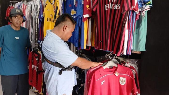
Qatar National Team Official Squad for FIFA World Cup 2026: Akram Afif and Almoez Ali Lead the Charge

-
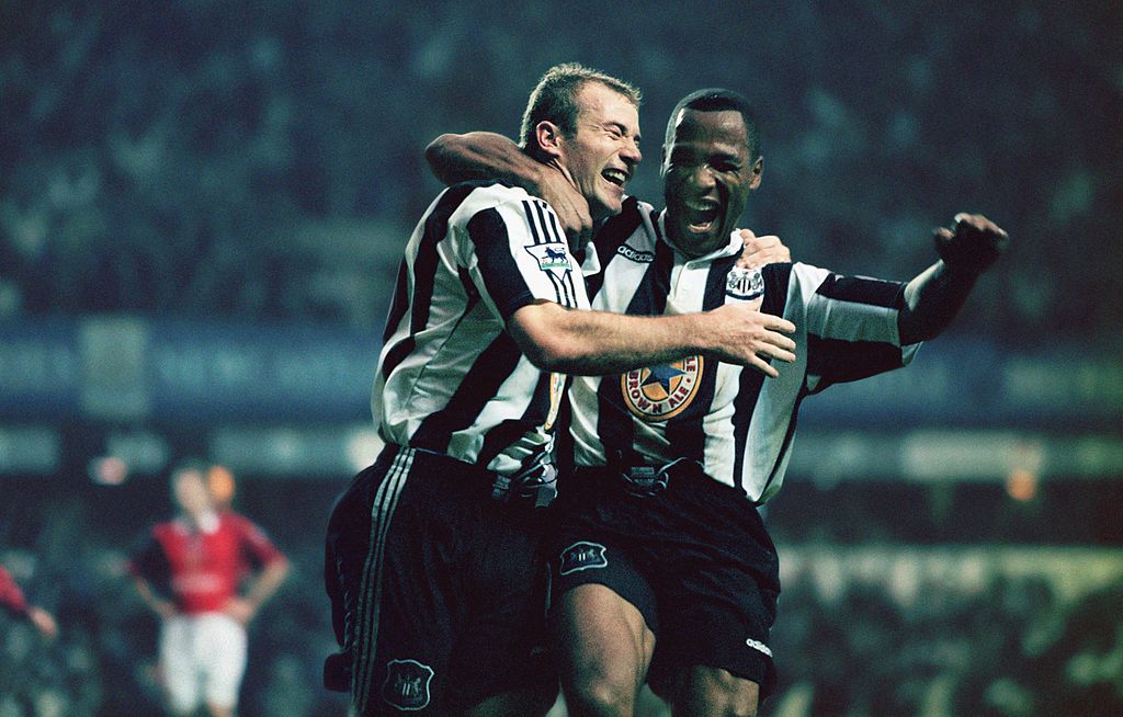
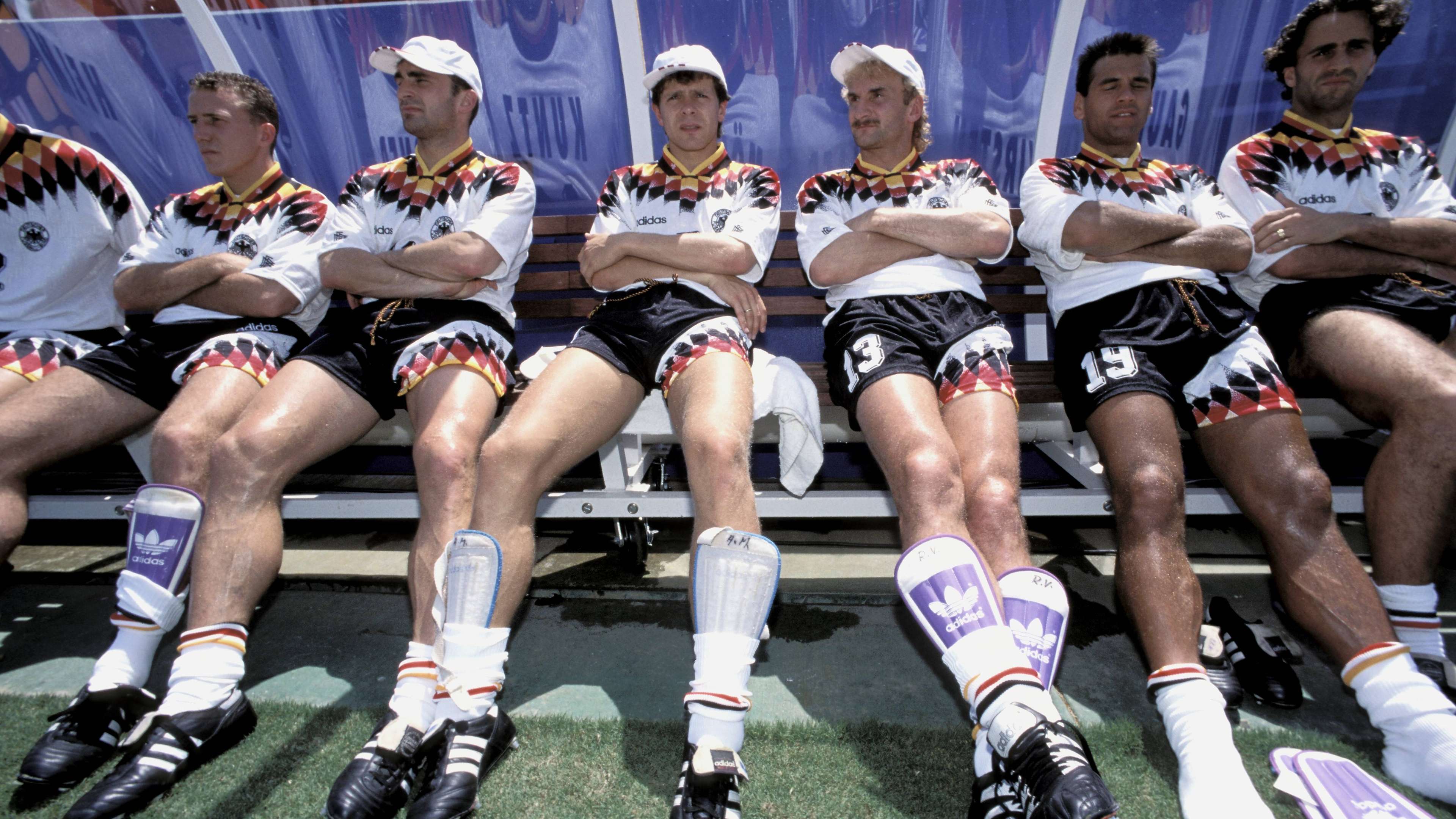
“It Always Revolved Around the Players’ Wives”: How the German National Team Fell Apart During the 1994 World Cup in the USA
-
Aston Villa’s Morgan Rogers open to Arsenal move amid Manchester United interest

-
Live TVRI Schedule for the FIFA World Cup 2026: Turkey National Team and Real Madrid Star Arda Guler