Every year, the nation unites for two days to celebrate the founding of the UAE, the historic unification of all seven emirates that shaped the country as we know it today.
To mark Eid Al Etihad this year, authorities have unveiled a new logo designed to bring consistency to all related celebrations. The design draws inspiration from early street signs, serving as a tribute to Sheikh Zayed’s visionary leadership.
Stay up to date with the latest news. Follow KT on WhatsApp Channels.
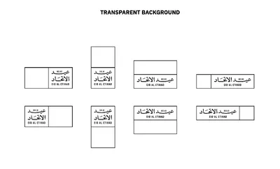
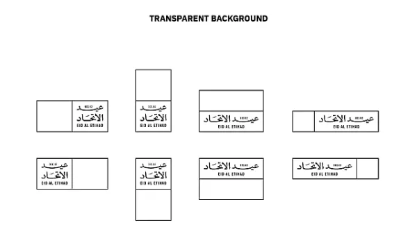
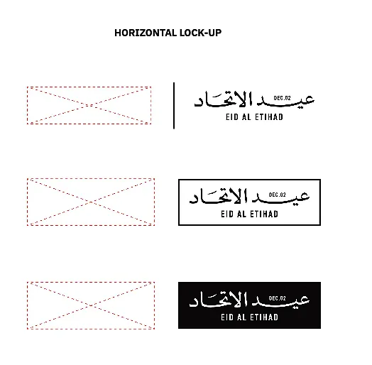
Alongside the launch, detailed guidelines have been issued for its proper use. The logo is available in three versions: a primary version (without a frame), a framed version, and a negative version. Here’s what you need to know before using it:
GuidelinesHere are the guidelines to abide by if using the logo:
1. Typeface:
Here are the typefaces that must be used for the Eid Al Etihad
Primary English: Vinyl
Secondary English: Trade Gothic Next
Primary Arabic: Athelas Arabic Variable
Secondary Arabic: Source Arabic Sans
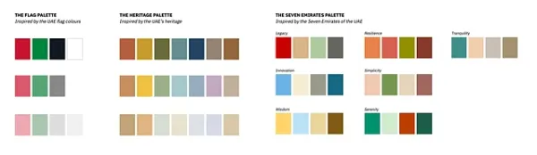
2. Colour scheme:
The colour scheme is built around three main palettes:
The Flag Palette, inspired by the UAE flag and how its colours respond to light.
The Heritage Palette, reflecting the essence of our culture through neutral tones.
The Seven Emirates Palette, where each emirate is represented by a defining keyword and a colour palette that reflects its unique identity.
Take a look at the different colour palettes below:
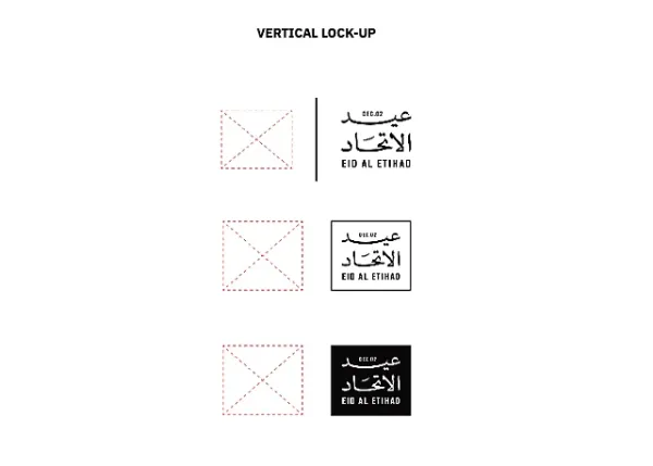
3. Dynamic logo extensions:
Logo frames have been extended in some cases to ensure it is dynamic and flexible. This is to help it accomodate things like illustrations, images and the year. Here's what that would look like:
4. Co-branding
The authority has also created lock-ups for co-branding which will help maintain visual balance, clear spacing, and brand integrity.
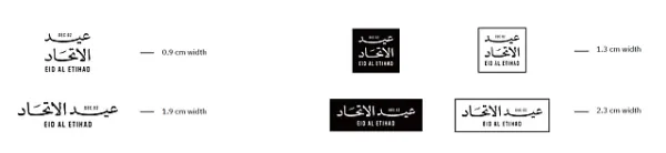
5. Minimum size:
The authority has recommended a minimum size for each type of logo to ensure it remains legible.
 Don'ts for logo usage
Don’t stretch or distort the logo
Don’t rotate the logo
Don’t substitute typefaces within the logo
Don’t use the logo as a decorative graphic or background pattern
Don’t translate the logo into other languages
Don’t use unapproved logo lockups
Don’t place the logo inside unapproved shapes or containers
Don’t combine the logo with other logos
Don’t add drop shadows or effects
Don’t resize individual elements of the logo
Don’t recolour the logo arbitrarily
Don’t place the logo on low-contrast or cluttered backgrounds
-
Stock Market today: Sensex, Nifty face volatility; top gainers and laggards on NSE

-
High-polluting industries in Delhi under scrutiny as DPCC seeks expert inspections

-
Kantara Chapter 1 collection: Rishab Shetty's film enters Rs 300 crore club in just 7 days

-
In a major mix-up, brain chemotherapy drug mistakenly given to lung cancer patients in Trivandrum RCC
-
Hyderabad: Rly announces special train, makes terminal changes, route upgrades to cut travel time, meet passenger demand